[size=200]Introduction[/size]
Hi, I’m Dre. I’m here to share my experiences with producing IC documents for LARP. When I started out, I had no experience in desktop publishing whatsoever, but I wanted to create booklets and pamphlets and other documents that would feel immersive, rather than remind people of their actual modern printed origin. Over the years I’ve learned a few things and I wanted to share.
I’ll say it now: I’m by no means an expert at this. There are others with far greater skill, and I absolutely welcome additions, suggestions and corrections to this guide. If it takes off, I’ll edit this post with people’s suggestions as it progresses. I have a lot yet to learn myself!
[size=150]1. The tools[/size]
At the most basic, you need:
- A word processor
- A nice font
- Access to a printer.
Ideally, though, if you’re wanting to pull off some really nice-looking documents, you’ll want to go a bit deeper and dip your toe into publishing software. There are plenty of commercial options: Publisher is widely-known, there’s InDesign, QuarkXpress, etc. but most of these are serious commercial tools that require a large outlay if not a subscription outright.
Personally, I use Scribus. Its major advantage is that it’s open source and thus free to use, and it has a lot of powerful functionality built into it.
If the prospect of a desktop publishing program is daunting, never fear! There is a simpler alternative - Powerpoint, or its open source counterpart OpenOffice Impress. I’ll get to why these programs work for typesetting in a minute.
Why not just use Word?
The chief reason is flexibility. Word is great - for producing documents that look like they were typed in Word. Modern versions especially do a lot of automatic formatting which is a nightmare when you’re trying to get a document look just right. In theory Word can do almost everything… but unless you’re a complete pro at using it, you’ll bash your head off the screen well before you’re finished. Having said that, modern versions of Word are a bit easier to use.
Publishing software (and to a lesser extent, presentation software) lets you arrange your text any way you like, layer it, rotate it, and generally keep elements nice and separate for ease of access. Importantly, it also works on the basis that what you see is what you get - so there’s no risk of the formatting being messed up by printing or exporting to pdf. There are some very nice advanced tools as well; you can set font styles for different elements, and adjust minutiae of letter spacing, sizing and so forth to get it all just right.
I should mention that you can also use image manipulation software like Paint.NET, Photoshop or GIMP to create documents, and indeed if you have a lot of images/art it may be a good way forward. However, organising text is a painstaking process with such programs.
[quote=“tea”][ul]]A typesetting tool worth mentioning is TeX, which is very powerful (but quite complex) and entirely free. It has extremely good text layout algorithms, particularly for linebreaking and so on, and because of how it works is excellent for producing lots of documents with a consistent style and layout, such as a number of pamphlets or a set of songbooks or the like. You can set up templates and styles to automatically typeset each document in the same way, and get a good-looking result for all of them.
Further information about how to install and use TeX is readily available through Google. Using a version called XeTeX is generally ideal, as it gives you very good font access and control of some fancy typography features quite easily, which have historically been major issues with using TeX to do design work./][/ul][/quote]
A word of warning. There is a bit of a learning curve to using something like Scribus or TeX. But once you get the hang of them, you’re golden! And as tea points out, once you have your preferred program set up the way you want it, you can easily replicate your efforts in no time flat.
[size=150]2. Making it look nice[/size]
So you’ve just banged out your fresh new pamphlet debating the Virtue of live pigs and now it’s ready to be typeset. If you were living in a pre-computer society you would have two options for producing copies of this document:
- Write it out by hand lots of times
- Use a manual printing press
Fortunately for us, Empire includes 2. as an IC option!
2.1. Source material
Here is where the aspirational aspect comes into play. As with any costume or prop-making, it is useful to take some references from history to get a feel for what texts could look like, and then play off of the sources to make something “coolthentic”. Obviously if you have a replica 15th century hand press, go ahead and use that (but then I suspect this guide isn’t for you). Let’s look at some antique documents.
Ahh, blackletter. Notice the emphasis on decoration; even here the dropped caps are intricate.
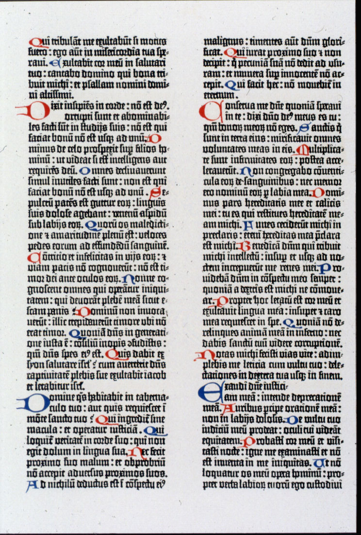
Colour! It’s more expensive to print but entirely worth it. It’s pretty easy to replicate that “added in by hand” effect with a little effort; you just need to pick your fonts.
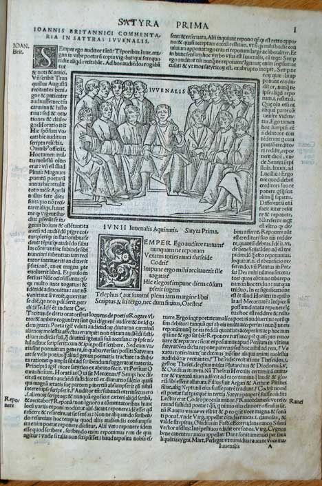
Here’s a good example of a template that includes a picture. You can find woodcuts of many different types online; I personally would kill to find someone able to reproduce that style of picture. Such a person would be worth their weight in gold to an IC newspaper, in my opinion!
We can get a sense of what printed materials were like: dense words, intricate lettering, and an emphasis on decoration. To our modern eyes they are difficult to read, so let’s avoid the density. We can see clear lines delineating sections, and despite what I personally have tended to believe about old texts, they don’t print all the way to the edges and do in fact leave big spaces.
2.2. Fonts
Fonts make or break a document. Fortunately, it’s extremely easy to find fonts online. Probably the best resource I’ve found is DaFont.com. Take a look in their Gothic-medieval section and in their Script-calligraphy section, but have a hunt around. Look for fonts that have the “feel” you’re after; avoid ones with modern effects added to them like noise, or those with excessive flourishes (unless it’s for very limited use). Many of the fonts you will find will not be complete; that is, they will lack some symbols or accented characters. This may require you to either edit your text to fit, or else use a substitution font. In one of my booklets I had to change fonts for my asterisk-marked section dividers!
If you like dropped capitals (which I do), there are plenty of fonts specifically for them. Go crazy with them!
If you’ve never installed a new font in Windows, it’s pretty simple. Unzip the font file to any directory you like, then go to your Windows directory, Fonts folder, and copy the files (usually .ttf extension) into that folder. It normally shows a little progress bar. Do this before opening your word processor or publishing software, or else the fonts won’t be available; you may need to restart your computer if all else fails.
As a general rule, avoid sans serif fonts (like Arial, Calibri, etc.). Their clean lines look extremely modern.
I can’t tell what makes a font look modern!
There are some useful sources for this.
[quote=“Nette”][ul]
]Also, This Timeline is really cool./][/ul][/quote]
2.3. Images
It’s extremely difficult to make images look convincing. Google image search helps by allowing you to restrict to black and white when looking for potential images. The search term “woodcut” is helpful, too. I keep a respository of interesting medieval pictures, but as noted above, if you’re really dedicated, the best ones are purpose-made. Potentially, with some image manipulation wizardry you can make pictures look the part; in which case you either want to make them into line drawings (woodcut style) or full colour “painted-in” images.
2.4. Coolthentication
This is an area I haven’t experimented with enough, but here’s the theory. Old typeset documents have a kind of charm to them by the slight smudging on the lettering, minute inconsistencies in the spacing of letters, and other artefacts of the manual press. Hand-written documents have ink that isn’t solid blocks. I suspect that with some Photoshop-style wizardry you could create an effect to emulate these features, but it’s technically beyond me. Aspirational, though!
Daisy has an excellent thread on how to make printed documents look more IC - I strongly suggest checking it out! Moving between formats to make your IC document into an image file can be fiddly, but worth the effort if you want to go the extra mile.
You can also do some interesting things by playing with the fonts themselves:
[size=150]3. Printing[/size]
So you’ve got your document all sorted out the way you want it. Now it’s time to print!
If it’s a single page document like a poster then go straight on ahead.
If, however, it’s a booklet, then you’ll need to do a bit of wizardry.
http://help.adobe.com/en_US/indesign/cs/using/images/nm_41.png
The above diagram helps to plan out your document for printing as a booklet. The method I tend to use for an A5 booklet is to lay out each page side by side on an A4 template, and then re-order them for when it comes to printing. You need to factor in the number of pages - 8 is fine, but 7 or 9 will require you to have blank pages, for instance.
[size=130]Here’s one I made earlier![/size]
This is a little booklet I made for Empire, containing some phrases I use in rituals, laid out ready for printing: PDF document.
Paper and sizing
Old paper has a very distinctive texture to it; it’s more rugose, with a bit of fabric-like texture to it, and often softer. These are qualities it is difficult to get in printer-friendly paper. High-grain “parchment” paper or off-white paper is best; you’re trading the coolthentic “feel” for a coolthentic “look”. Get the most expensive paper you can afford, and test your designs on scrap white paper. If you’re lucky, you might find cheaper, recycled paper with a bit of character to it.
Tea- or coffee-staining is also a good way forward especially if the document is old IC.
Modern paper and publications are all in standard ISO sizes. If you’re looking for a bit of extra “feel” for your documents, consider taking a guillotine to the edges (and don’t bother being exact about orientation) to give them a non-standard size.
That’s it from off the top of my head - I’m certain I will remember more later. As I said, I’ll be adding people’s suggestions and details to this post as time goes on.
Version log
1.0 - initial posting
1.1 - added a couple of bits on finishing
1.2 - added quotes from helpful people!
1.3 - added a link to Daisy’s IC paper document guide.