So I’m going to preface this with I know there aren’t defined colours for the realms.
I’m asking for peoples personal opinions and feelings on the matter, because I’m presently thinking of trying to incorporate two realms into heraldry and it seemed like an interesting question.
Don’t feel you need a list of 6 to contribute, if you have an idea for the realm(s) you interact with, and none of the others I’d still be interested.
Hmm. Just off the top of my head, my gut colours are:
Spring: green, yellow, light brown
Summer: gold, yellow, orange, white
Autumn: copper, orange, brown, deep red
Winter: white, black, light blue
Day: turquoise, white, angles and lines
Night: black, green, blue, swirls and chaos
If I go for a 6 colour system, I default to Black/White/Brown/Green/Red/Blue…
…I blame all those years playing Treasure Trap LARP
Night - Black, possibly a shiny iridescent black like a ravens wing
Day - White. Maybe like fine marble, with little speckles of quartz.
Spring - Green. A mottled and shifting pattern of greens.
Summer - Red. Passion and fury and swirling motion
Autumn - Brown. The rich browns of autumn leaves, of chocolate, of seasoned wood and long-brewed chai…
Winter - Blue. The blue of sunlight through deep ice, a spectrum of pale to deep, stark, uncompromising, beautiful.
Day - white
Night - black
Winter - blue, all shades
Summer - yellow or green (pick one), again all shades
Spring - yellow or green (pick one), again all shades
Autumn - red (could also be orange or brown), again all shades
I think what colours people associate with each realm is going to depend on what symbolism they associate with said colours and whether they are familiar with a specific heraldry system or not (I like medieval heraldry, metals and colours etc and so forth, even though I don’t always follow the rules).
The main thing for me would be to get a good contrast, so people can see the heraldry and recognise it from far away (my viewpoint is ‘why put the effort into making heraldry if people can’t see it and admire it?’).
All that really matters is that you see the colour association and you are happy with it. If that means dark pink for Winter and purple for Spring, go for it. You can always explain the symbolism to other people (and wouldn’t a heraldry based on fuchsia flowers look awesome?!)
When I helped set dressed the hall of worlds, we would think of the below:
Winter- White, pale grey, silver, black, very very small amounts of red and some times dark green. The effect is stark and bleak.
Spring- Deep greens, browns, earthy tones, very small amounts of yellow, red, blue, and pale green. The effect is growing up and wild
Summer- Yellows, Reds, whites- Big brash and bold.
Autumn- Gold, Light brown, brass, orange, metallic- The effect should be busy but ordered, complex
Day- white, sky blue and royal blue, Pale yellow, some other colours in detail and contrast. we liked to play on the polarising effect of sea and sky, true and false ect
Night, Dark multifaceted colours. Dark Purples, Dark greys, small bright spots of colour,
use shades of colours and textures to give a hidden deepness,
This is obviously quite broad but it should show that some colours can tie into multiple realms in different ways and tones. Bright red leans to summer, dark red to autumn, blood red to winter, pinkish to night ect ect
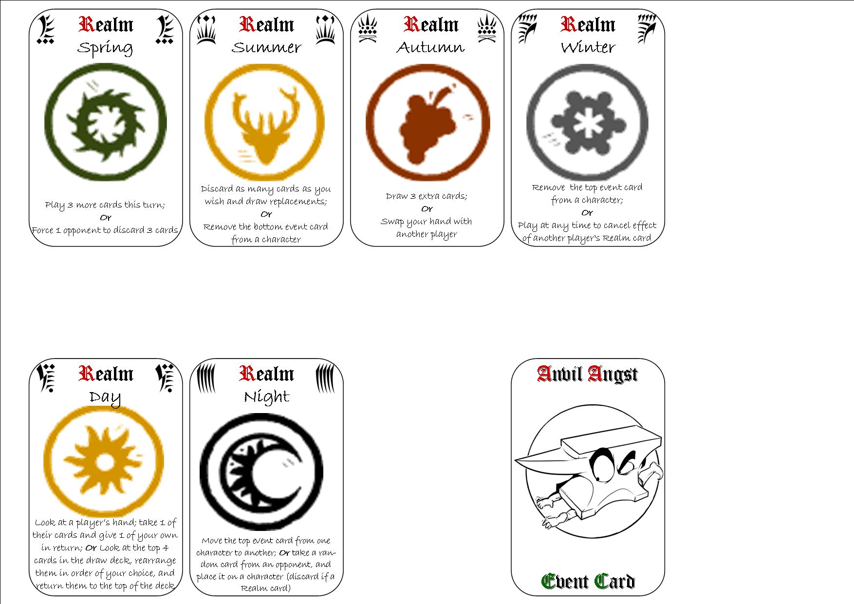
For the Realm cards in Anvil Angst (one of the games by the Guild of Good Games) I used Green for Spring, Yellow for Summer, Russet for Autumn, Grey for Winter, Yellow for Day, Black for Night - In retrospect not sure why I duplicated yellow - perhaps due to problem of printing White which would have been an option for Day. It would have been better I think to have gone for a paler green for Spring and a darker green for Summer.